
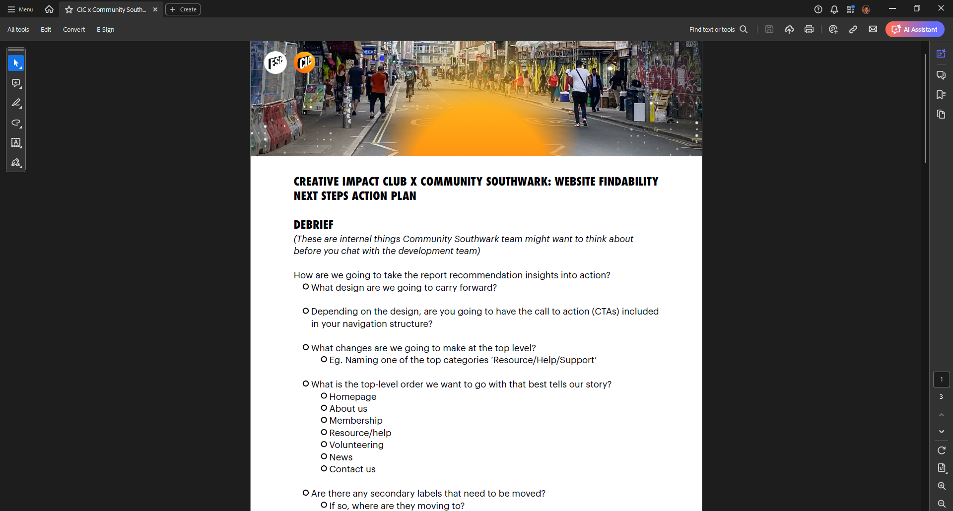
Simplifying Site
Structure
Role: UX Consultant
Team: UX Consultant
Skills: User Research, Design, Content Design & Prototyping
Summary
Community Southwark needed a clearer, more intuitive website to help local residents, charities, and volunteers find the support they needed. I led a strategic overhaul of the site’s information architecture using card sorting, stakeholder collaboration, and a content-first approach.
The result was a simplified navigation system grounded in user needs, improved search clarity, and stakeholder alignment, laying the foundation for a more accessible and effective digital presence.
Situation
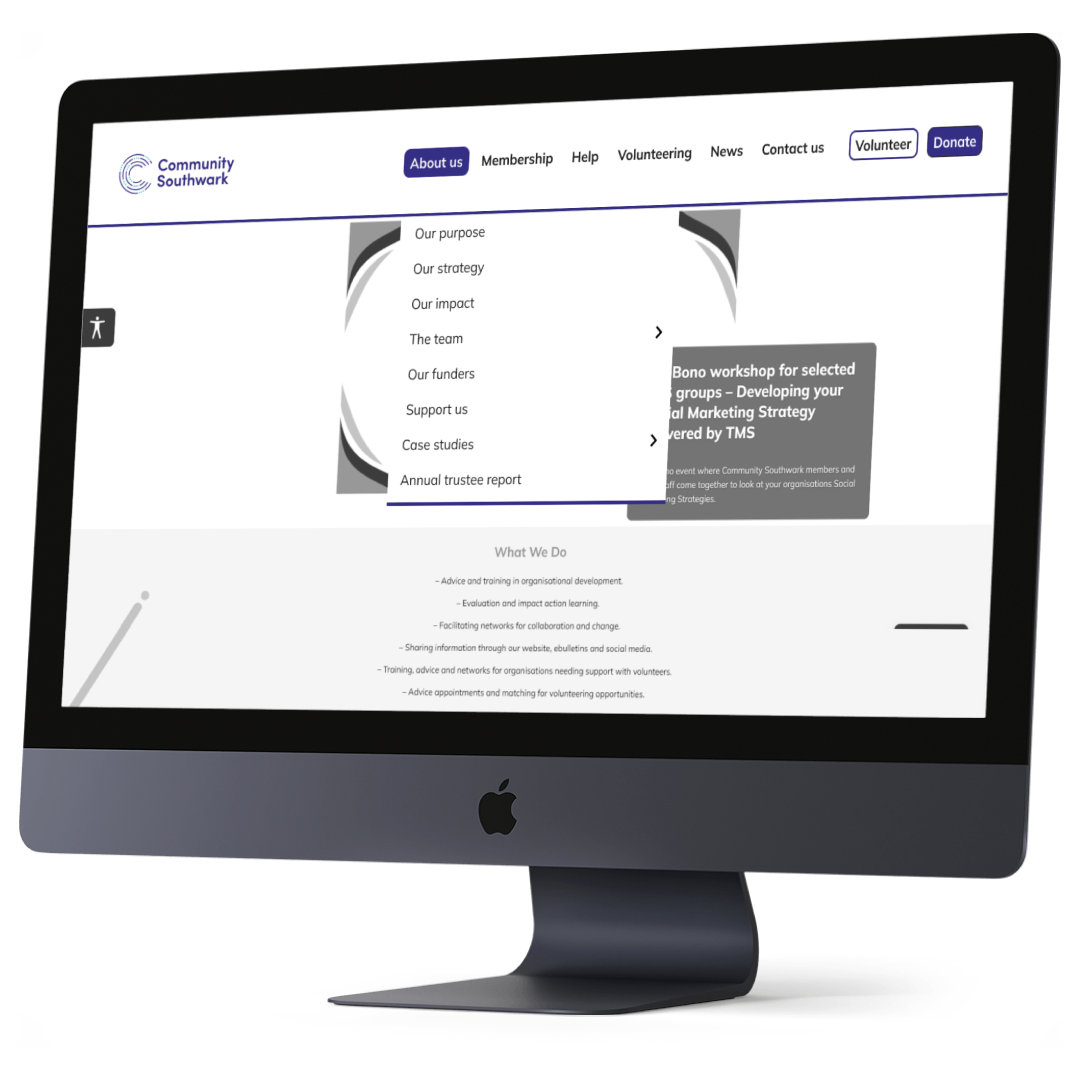
Community Southwark, a charity supporting the voluntary and community sector, had a cluttered, outdated website. Navigation was inconsistent and overloaded, users couldn’t find key resources, and internal teams struggled to maintain content. They needed a complete restructuring of their site to better serve service users, donors, and volunteers.
Task
My role was to lead the UX content strategy and IA redesign, ensuring the new site structure reflected the diverse needs of multiple audiences while aligning with the organisation’s goals.
Action
User Research & Testing
Conducted card sorting exercises with community members, volunteers, and staff to understand how they grouped and labelled information
Reviewed site analytics to identify high-traffic pages, search drop-offs, and navigation pain points
Synthesised findings into actionable navigation priorities
Content Strategy & Taxonomy
Created a revised IA based on user mental models
Developed a scalable, modular navigation structure
Proposed a simplified taxonomy with clearer section labels and improved wayfinding language
Stakeholder Collaboration
Facilitated workshops with the internal team to align organisational goals with user priorities
Partnered with the web development agency to ensure implementation matched the new IA vision
Delivered annotated wireframes and content structure documentation for handoff
Results
Simplified navigation structure now reflects real user behaviours
Bounce rates expected to decrease (pending post-launch analytics)
Improved internal understanding of content roles and IA principles
Positive feedback from stakeholders on clarity and usability of the proposed design
How I Made It Happen
A behind-the-scenes look at strategy, process, collaboration, and what I’d do differently.

Strategic Leadership
I brought content strategy to the heart of the IA redesign, crafting not just new labels and links, but a scalable taxonomy and content governance model. I helped the charity think beyond site pages and focus on the intent behind content.
Collaboration
I led the end-to-end stakeholder engagement, running discovery sessions, facilitating IA workshops, and aligning cross-functional teams to ensure we landed on a navigation structure that made sense to both users and staff.

Research
Card sorting (open and hybrid. Site analytics and clickstream data. Direct user interviews with volunteers and partner organisations. These methods ensured content and IA decisions were user-informed, not internally biased.

Process
We moved from: Auditing content and existing structure. Synthesising insights into a proposed IA. Collaborating with stakeholders for validation. Delivering annotated IA documentation and navigation prototypes

What I’d Do Differently
Given more time, I would have liked to validate the proposed IA via tree testing to confirm user comprehension. I'd also build a content ownership model to support ongoing governance and sustainability post-launch.