What conversational design taught me about CTA’s
“You must unlearn what you have learned.”
— Yoda, The Empire Strikes Back
Working with conversational UX has made me rethink one of the most familiar parts of product design: the call to action.
CTAs still matter. A lot. They are often the moment where intent turns into action. They help people move forward, make decisions, complete tasks, explore options and commit to the next step.
But conversational design and designing for LLM/AI experience have taught me that a CTA is no longer ‘just’ a button at the end of a journey. In a chat interface, a CTA becomes part of the journey.
It becomes a response. A prompt. A suggestion. A moment of recognition. A way of saying: we have understood what you need, and here is a useful next step.
Not that might sound simple. But it is not. Because once a CTA moves into conversation, the work changes.
Traditional CTAs were designed for static journeys
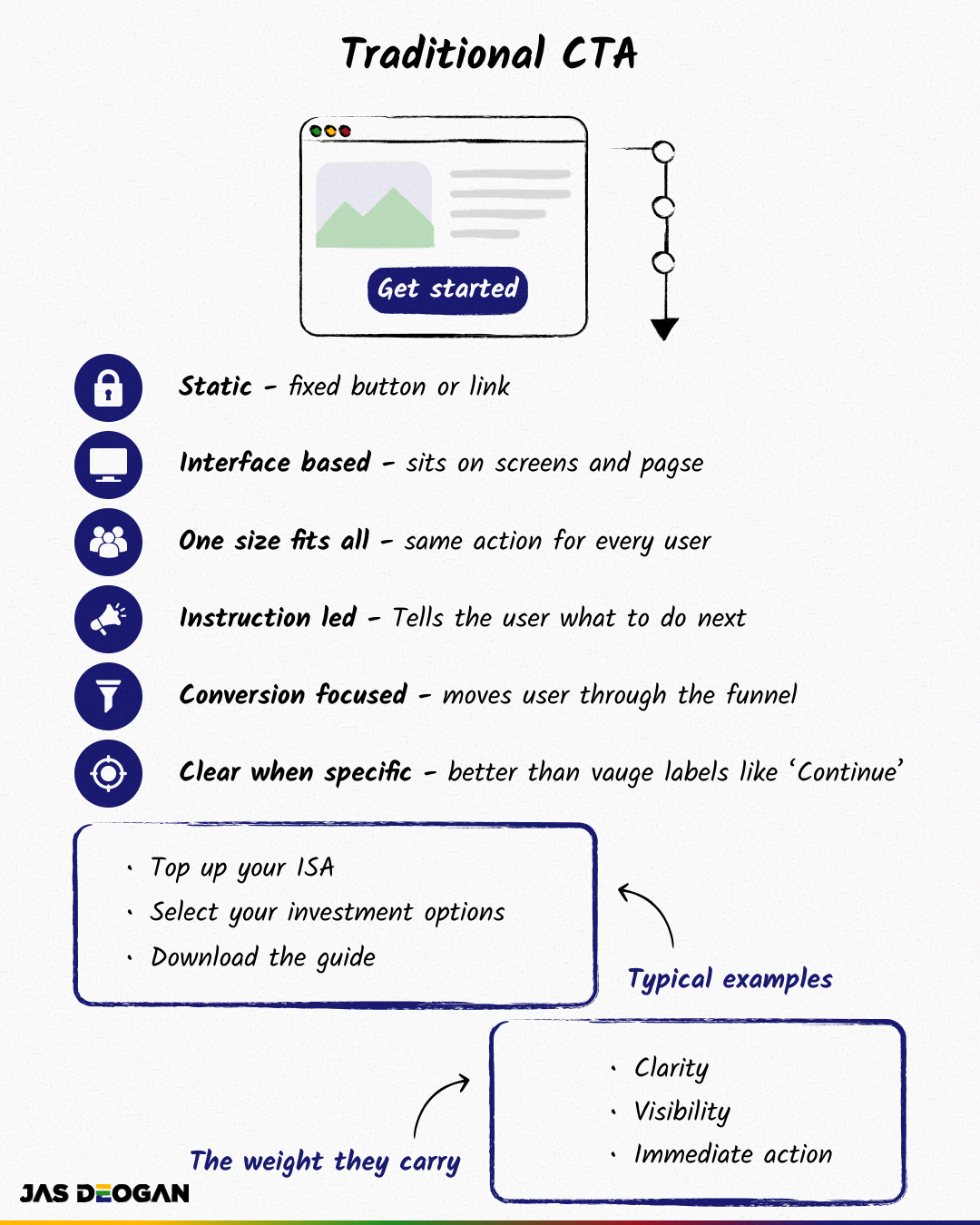
Most of us have spent years thinking about CTAs in the context of screens. A user lands on a page. They read the content. They reach a button. They decide whether to act.
In that world, the CTA has a clear job. It needs to be visible, understandable and actionable.
Good CTA content tells the user exactly what they are doing. Top up your ISA. Select your investment options. Book your appointment. Download the guide.
Bad CTA content hides the action. Continue. Next. Let’s go. Click here.
Those labels may look harmless, and sometimes they may work, and they often create uncertainty. They do not tell the user what will happen. They rely on the interface around them to do the explaining.
And when the interface does not do that work well, the user hesitates. And that is where the old line still holds true for me:
If the user cannot do something, we have a UX problem. If the user will not do something, we may have a content problem.
I believe that CTAs sit right in the middle of that. They are where comprehension, confidence and action meet. But conversational design stretches that thinking further.
Conversational CTAs are not just instructions
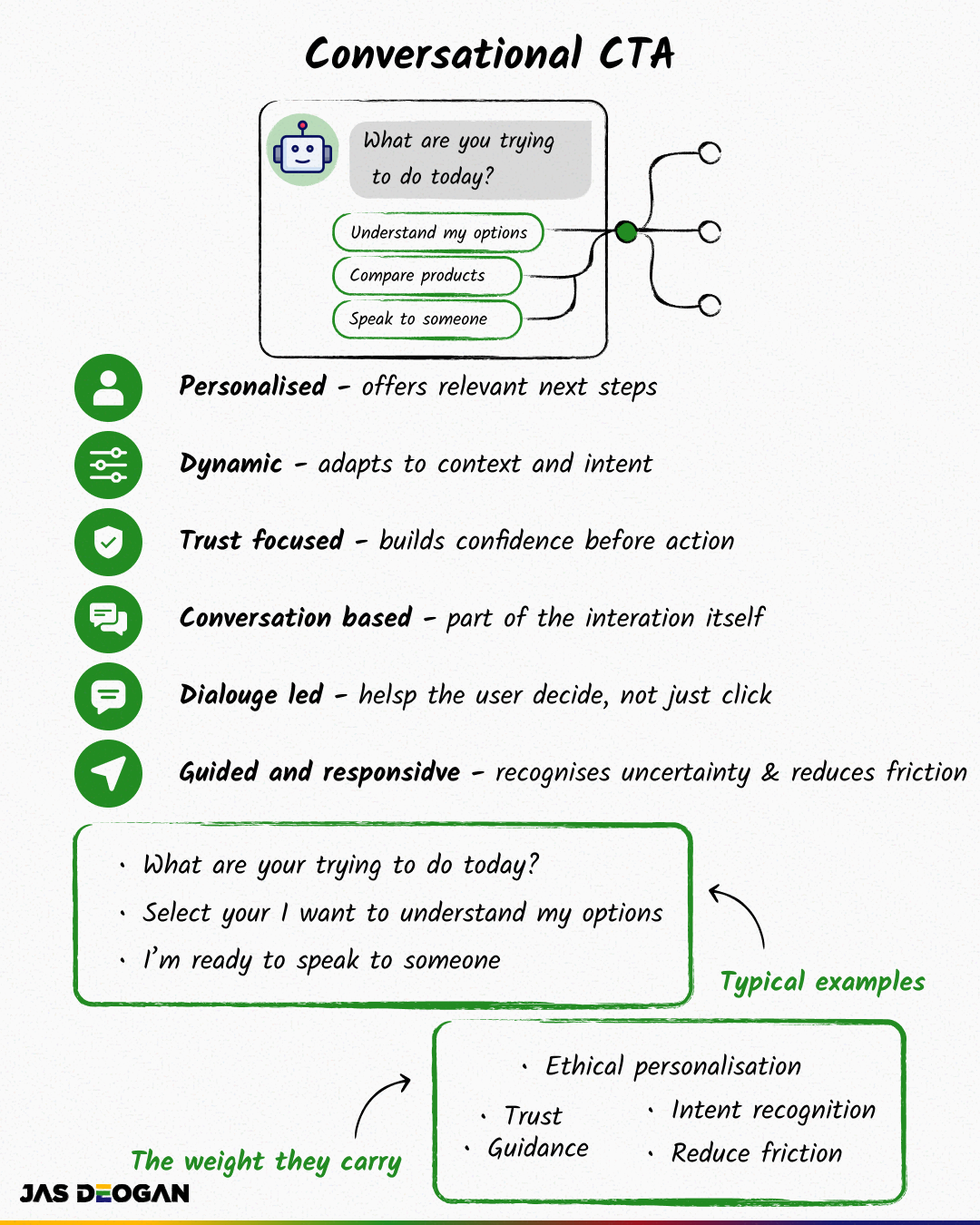
In a conversational interface, the user is not always following a neat, linear path. They may arrive with a question. They may be unsure what they need. They may be comparing options. They may be anxious about making the wrong choice. They may not know the right language to use yet.
That changes the role of the CTA.
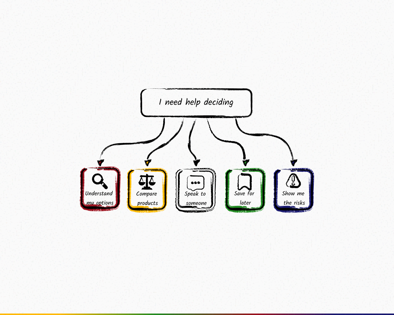
The system cannot simply say “Get started” and expect that to be enough. It may need to ask: “What are you trying to do today?” Then offer routes based on intent: “I want to understand my options.” “I need help choosing.” “I’m ready to apply.” “I want to speak to someone.”
That is a very different design challenge. The CTA is not just telling the user what to do. It is helping the user understand what they can do. And that is a shift in thinking and designing.
Traditional CTAs are often designed around business intent, while conversational CTAs need to balance business intent with user intent in real time. And that balance is where content design becomes essential.
The CTA becomes a turn in the conversation
One of the biggest lessons from conversational design is that every message creates expectation.
When a system asks a question, the user expects it to listen.
When a system offers a choice, the user expects each option to mean something.
When a system recommends a next step, the user expects it to be relevant.
That means a conversational CTA cannot just sound good. It has to work as part of the exchange.
It needs to understand context.
It needs to recognise intent.
It needs to reduce friction.
It needs to make the next step feel natural.
It needs to give the user enough confidence to continue.
This is why I think we need to stop thinking of CTAs as isolated pieces of microcopy. In conversational UX, the CTA is a turn. And a turn has responsibilities.
It has to pick up from what came before.
It has to move the conversation forward.
It has to leave space for the user to respond.
It has to make the system feel coherent.
A CTA in a chat interface is not just a conversion device. It is part of the relationship between the user and the product.
This is where AI raises the stakes
AI-powered tools make this even more important. Because AI can generate language quickly and at scale. It can produce prompts, suggestions, summaries and recommendations. It can sound helpful even when the underlying experience is not.
That is useful. But it is also dangerous. Because a conversational interface can make weak design feel smoother than it really is.
A chatbot can hide a messy journey. A friendly prompt can disguise a lack of clarity. A personalised recommendation can feel helpful, or it can feel pushy. An AI copilot can support the user, or it can quietly steer them somewhere they were not ready to go.
This is why content designers need to be involved early. Not after the flow has been built. Not when the assistant needs “some personality”. Not when the team wants the chatbot to sound more human. Early.
Because conversational CTAs are not just words. They are system behaviour. They are decisions about timing, sequencing, intent, choice, recovery, escalation and trust.
What I have learnt to look for
Working in this space has made me ask different questions. Not just: Is the CTA clear? But:
Why is this the next best action?
What does the user need before they can act?
Is the system responding to intent, or forcing a route?
Are we giving the user a real choice, or just the illusion of one?
What happens if the user says no?
What happens if they are unsure?
What happens if the system misunderstands?
When should we stop nudging and start supporting?
When should we hand over to a human?
Those questions matter because conversational CTAs can reduce friction, but they can also create pressure. They can make journeys feel natural, but they can also make persuasion feel invisible. They can support the user, but only if the system has been designed with care. This is where the maturity of the organisation shows.
A mature conversational experience does not just ask, “How do we get the user to convert?” It asks, “What does the user need to feel ready, informed and in control?” That is a better question. And usually, it leads to better design.
Accessibility is part of the conversation
It is easy to talk about conversational CTAs as if they are mainly about tone. Make it warmer. Make it shorter. Make it sound more human. But accessibility cannot sit behind the personality layer.
A conversational CTA still needs to be clear, descriptive and predictable. It still needs to work with assistive technology. It still needs a meaningful sequence. It still needs to support keyboard navigation, visible focus, strong contrast and usable tap targets when it appears as an interactive element.
But in chat, accessibility also becomes cognitive.
Can the user understand what is being asked?
Can they predict what happens next?
Can they recover from a mistake?
Can they change direction?
Can they pause?
Can they choose from manageable options rather than being overwhelmed?
A conversational CTA that sounds natural but creates confusion has not done its job. Clarity is not the opposite of personality. Clarity is what makes personality usable.
The future of CTAs is not more buttons
The future of CTAs is not about making buttons more persuasive. It is about designing better moments of action. Sometimes that moment will still be a button.
Sometimes it will be a suggested reply. Sometimes it will be a question. Sometimes it will be a recommendation. Sometimes it will be a handover. Sometimes it will be a pause. Sometimes the most useful action will be giving the user permission not to act yet. That is the part I find most interesting.
Conversational design moves us away from the idea that every CTA exists to push the user forward. Sometimes the role of the CTA is to help the user make sense of where they are. That is a very different kind of design.
It asks content designers to think beyond labels and into behaviour. Beyond action words and into user readiness. Beyond conversion and into trust.
Content designers need to lead this shift
This is not about protecting the old version of content design. It is about designing the next one. As products become more conversational, content is no longer just what appears on the screen. It is what shapes the interaction.
The CTA is a perfect example of that shift. It used to be something we placed in an interface. Now it is something we design into a conversation.
That means content designers need to be braver about where we show up. We need to be in the room when teams are defining intent models, conversation flows, AI behaviours, escalation paths, prompts, choices and decision logic. Because we are not just writing the words. We are shaping what the system does with them.
And if conversational design has taught me anything, it is this: The next CTA will not always look like a CTA. But it will still carry the same responsibility. To help someone move forward with clarity, confidence and control.
Not because the system pushed them. Because the design understood them.